Alerts
Alerts are used to attract user's attention for important information without interrupting the user's flow.
Example of Alert Bar without close button
Alerts are available in 5 types- success alert, error alert, warning alert, primary alert, secondary
alert.
To use this alert just use class name alert-box
and also add class according to alert type- alert-primary,
alert-secondary, alert-danger, alert-success, alert-warning. (e.g.class="alert-box alert-primary").
You can copy html part
from below code snippet.
Example of Alert bar with close button
Alert can have cross icon to close the alert. Check out html and vanilla JS code below.
JavaScript
Avatar
Avatar can be used to show user's profile picture on profile information page, on navigation bar, in blogs grid items.
Example of Image Avatar
Avatar is available in 4 different sizes. You can use image in Avatar. You need to include class
avatar and for size add class according to size avatar-lg-size, avatar-md-size, avatar-sm-size, avatar-xs-size
(e.g. class="avatar avatar-lg-size")
Don't forget to add Responsive Image class names for img element.
Example of Text Avatar
You can use initial letters of user in Avatar as well. You need to include class avatar-text along with avatar and size class. (e.g. class="avatar avatar-lg-size avatar-text")
Badges
Badges are being used to display a notification count or status information
Example of Status Badge
We have 2 types of status badges that can be integrated with Avatars. You can show colors to show the online status of user. And to show cart or notification count, you can use number badge. Check code below to copy the html part as is.
Example of Text Badge
We have 2 types of text badges that can be integrated with text. Badge with rounded edges and square edges. Font size of badge text is in em. It will change as per the parent element's font-size.
Example of Heading with Badge New
Example of Heading with Badge New
Example of Heading with Badge New
Example of Heading with Badge New
Example of Heading with Badge New
Example of Paragraph with Badge New
Buttons
Buttons are also called as call to action. We have range of buttons and their states. You may use a tag or button element, you need to add respective classes, and you are good to go.
Example of Primary Button Styles
Whenever you want your user to click on a link or button, use primary style buttons.
Example of Secondary Button Styles
If you want user not to pay attention to buttons then use Secondary buttons. You can directly copy below html code and use it in your app.
Example of Disabled Button
If you want to style disabled button add btn-disabled class and you are good to go.
Example of Different Button Sizes
If you want to have different size for your button, you can add btn-lg-size, btn-sm-size class for large and small size respectively.
Example of Toggle Button and Floating action Button
Toggle buttons can be used to change the theme. For class and html, check below code.
Floating-action buttons can be customized by adding the font-awesome icon of your choice. This
button will be fixed to right-bottom corner.
Cards
Card are used to show user related data collectively, like product details.
Example of Horizontal Card- Text+Image
Card's image may have a margin or it can be full-bleed. By default card's images are full-bleed. If
you want image to have margin, you can use default-container
class.
Copy below code and put your desired text and image and you are good to go.
 New
New
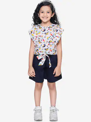
Pink Dress
Girls White & Blue Printed Dress
Sold by: Lil
Picks
White and blue printed playsuit with knot detail, has a shirt collar, sleeveless, button closures
New
Pink Dress
Girls White & Blue Printed Dress
Sold by: Lil
Picks
White and blue printed playsuit with knot detail, has a shirt collar, sleeveless, button closures.
Example of Vertical Card- Text+Image
Below are 3 variations, card with badge, card with image default-container, card with close button. All the cards have like button.
New
New
New
Example of Card with Text Overlay
You need to wrap element that need to be overlay and on which it is to be overlayed in a single div. Use class names as per below code.
New
Form Components
There are form fields listed below and form validation is also styled.
Example of Active form fields
Add form-label class to labels and form-field for input element, form-field, form-textarea for textarea element(mulitple lines
input).
Add form-label-required-field class to labels if the field
is required, it will show star on the field
Example of Disabled/Read only form fields
Add disabled attribute to your form element to make them
disable. No need to add any extra class.
Add readonly attribute to your form element to make them
read-only. No need to add any extra class.
Example of Read only plain text form field
Add read-only attribute to your form element to make them read-only. Add form-field-plain-text class to form field element.
Example of Form Validation
Below is the form validation example. You can have error message and check passed message on field level. For html and class, please check below html and for functionality, JavaScript code.
JavaScript
Images
Images can be responsive to fit the parent's width, and also can be customised to be round shaped
Example of Responsive Image
You can add class img-responsive to make your image fit the width of container. It's height will get adjusted by keeping the aspect ratio same. If you want to change the aspect ratio, you will have to crop the image.

Example of Round Image
You can add class img-round to make your image round shaped.

Lists
Lists can be used at so many places, navigation bar, stacked notifications, article pages, etc.
Example of Unordered List with bullets
Add class according to bullet style. Copy html code below and add your desired list items.
- list item1
- list item2
- list item3
- list item1
- list item2
- list item3
- list item1
- list item2
- list item3
Example of Ordered List with bullets
Add class according to bullet style. Copy html code below and add your desired list items.
To reverse the order of ordered list, add reversed attribute
to ol element
- List item with numbers
- List item with numbers
- List item with numbers
- Reversed list item
- Reversed list item
- Reversed list item
- List item with alphabets
- List item with alphabets
- List item with alphabets
- List item with roman
- List item with roman
- List item with roman
- List item with alphabets
- List item with alphabets
- List item with alphabets
- List item with roman
- List item with roman
- List item with roman
Example of List with no bullets
If you want list stacked but with no bullet and indentation, then you can add list-style-none class.
Class styled-list applies padding between two list items.
- list item1
- list item2
- list item3
Example of List with inline items
If you want list items in same line instead of stacked, you can add inline-list class to make it inline.
And you can also add
list-style-none class to remove bullets.
- list item1
- list item2
- list item3
Example of Notification Stacked List
This is stacked list without bullets. We can add desired component inside "li" element. Check below code for cards in stacked list.
Modal
Modals are positioned over everything else in the document and remove scroll from the page. It gets closed only with close button on modal pop-up.
Example of Modal
You need to have wrapper div modal-interstitial class. Inside
that, you can wrap content inside div.modal-content that you
need to show in pop-up.
Check out below code.
Live Demo
Click on the below CTA to open modal. Once the modal is open user will not be able to scroll or do any action on the main page. To close the pop-up, click on close icon or Back button. Functionality is achieved using JavaScript
JavaScript
Rating
Rating components can be used as read-only badge or in reviews section. Can be used in reviews section as form too.
Example of read-only ratings
There are two types, input read-only and badge
Live Demo
JavaScript
Slider
Sliders are used to decide range for something like sound in videos, price in shopping sites, etc.
Example of styled slider
Example of slider with icon
Example of disabled slider
Grid Simplified
Use grid when you want sections in view. Check below some examples of side by side cards.
Example of side by side (50:50) layout
Add grid-50-50-layout class on wrapper div which is wrapping 2 divs

Example of side by side (70:30) layout
Add grid-70-30-layout class on wrapper div which is wrapping 2 divs
Example of side by side (30:70) layout
Add grid-30-70-layout class on wrapper div which is wrapping 2 divs
Example of product listing grid (4 columns) layout
Add grid-4-column-layout class on wrapper div
New
New
New
New
Typography
Check out below text utilities.
Example of Heading text
For heading u can use h1, h2, h3, h4, h5, h6 elements.
The same font-styling is present for class names h1, h2, h3,
h4,
h5, h6 class. You can add one of these classes to style the text.
H1-Heading
H2-Heading
H3-Heading
H4-Heading
H5-Heading
H6-Heading
Example of Paragraph text
For paragraph u can use p element.
The same font-styling is present for class name p,
body-cp-rg class. You can add one of these classes to style the text.
Other than this if you want to adjust text to small or large, you can use body-cp-lg, body-cp-sm class.
P-Paragraph-body-copy-large
P-Paragraph-body-copy-regular style
P-Paragraph-body-copy-medium
P-Paragraph-body-copy-small
Example of Paragraph text
To align the text add text-center, text-left, text-right
class to wrapper element
H6-Heading Text Align Center
H6-Heading Text Align left
H6-Heading Text Align right
Example of Some Extra styles
- You can use the mark tag to highlight text. Add text-mark class to mark tag
- To strike-through the text, add text-strike-through class
- To make text bold (weight: 700), add text-bold-weight class
- To make text regular weight (weight: 500), add text-regular-weight class
- To make text light (weight: 300), add text-light-weight class
- To make text small in size (12px), add text-small-size class
- To make text color change there are 3 class, add one of the classes primary-text-color, secondary-text-color, tertiary-text-color
You can use the mark tag to highlight text.
This line of text is meant to be treated as no longer accurate.
Text with bold font weight
Text with regular font weight
Text with light font weight
Small size text
Text with primary-color
Text with secondary-color
Text with tertiary-color
Toast
This component can be used for toast or snackbar component. Toast is mostly used to show feedback message. Snackbar is to used show message that need user action
Example of Toast
Add toast class to wrapper. Toast has 3 themes, for error, success, warning, add toast-success, toast-error, toast-inform class to style the theme.
Live Demo
JavaScript